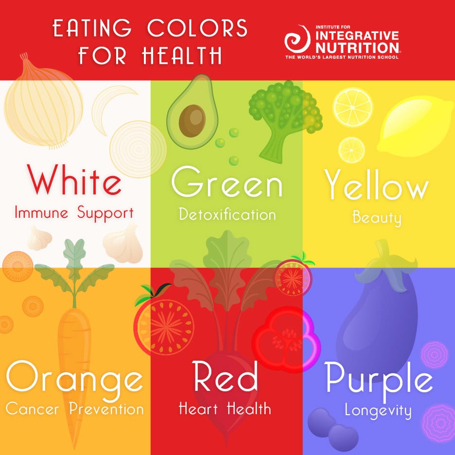
looking at colour palettes in order to gage a good scheme to suit my branding around, for branding i want a 5 tone colour, one of them neutral for the backgrounds, i also want healthy colours. Research has told me that these are the colous in food that are healthiest:
Orange and green seem to be colours that compliment each other in terms of web design. However if these colours are vibrant they seem to clash in a way that doesn’t feel pleasing on the eye. therefore i would either need to overlay these colours onto images to soften the vibrance or i would need to create pastel versions of these colours. Here is an example of a colour swatch with green and orange with some other fill colours which i think creates quite a good theme.

I have also looked at some colour palettes that have ben given out on the internet. These are good in terms of gaging the type of palettes that are used on websites and the standard colours that make up simple websites.


Although these are nice i feel like they could suit other branded companies better than mine. neither of them scream health to me and i feel that would reflect badly on the company.
the logo would also need to suit the branding scheme and therefore i need to take that into consideration when choosing the final colours. I feel that the palette that i have made is perhaps a bit dark and i should use some lighter pastels in order to get that bright healthy feeling.